Join the class of cool looks and responsive design.
Love is in the air.
I have found myself a new programming love: Bootstrap. To be honest, I’m not the only suitor; thousands of other programmers like me seem to share the same love.
What is Bootstrap? Bootstrap is a front-end framework, and as the say on its website: Bootstrap is the most popular HTML, CSS, and JS framework for developing responsive, mobile first projects on the web. Whether it’s the “most popular” I don’t know, but it sure got me hooked quickly.
Wikipedia says: Bootstrap, originally named Twitter Blueprint, was developed by Mark Otto and Jacob Thornton at Twitter as a framework to encourage consistency across internal tools.
Basically, it lets you develop webpages that are cross-browser-compatible with the latest versions of the most-used browsers across OS platforms, so you can target almost any device and present your data using the same code without doing any modifications. And that to me is pretty cool.
What are the downfalls? Well, some say that all Bootstrap sites look the same, but you can tweak it and add your own flavor. Of course, you have to dig into some CSS design, and that might not be your first task to do, but then again Google and Stack Overflow helps me on a daily basis.
Also I consider myself a web programmer, and my job is to provide users with business data, functions that help them do their jobs. I run a lot of our website on a local network, so it never sees the daylight of the “big” Internet. With that in mind, I find Bootstrap the perfect tool to create robust and useful pages that enable a lot of people do their daily work.
Stop talking, Jan! Get to the meat and potatoes, and let’s see some action!
I have one point to make: Bootstrap version 4 is coming, but I’ll use version 3 because version 4 is still an alpha version, and I therefore consider it too “young” to put into a production environment. Although it has some pretty heavy changes to version 3 code, I will still lean to version 3 in my next articles.
And now, action!
Implementing Bootstrap and Creating Your First Page
First rule: Bootstrap does not demand jQuery, but they work perfectly together, letting me have two great programming loves side by side.
You can download Bootstrap from http://getbootstrap.com and install it, so let’s do that to make sure that we get it to work. Here’s how it’s done:
1) Click on this link and select to save the zip file.
2) Create a folder in your webserver root. If you don’t have a webserver installed on your PC, just create a folder somewhere, because the examples I will create in the first article will work fine without a webserver installed. Let’s call the folder “bootstrap-part1.”
3) Copy the zip file to your “bootstrap-part-1” folder and unzip it.
4) Now you have new folder called “bootstrap-x.x.x-dist” where x.x.x is the version number of the current bootstrap distribution you just downloaded. Get rid of the x.x.x-dist and just rename the folder to “bootstrap.”
5) When you look in the bootstrap folder, you’ll see three folders like the one in Figure 1.

Figure 1: These are your bootstrap folders and files.
Inside these folders is all you need to get started. Instead of going through all the names of the files, we’ll create an example that will generate your first Bootstrap page.
Let’s Make Our First Bootstrap Page
At the end of this article, I have included a zip file that holds the example and code for this article, so you can just download that and unzip it to save you some time.
Before we go any further you need to know a few things.
Bootstrap uses HTML elements and CSS properties that require the HTML5 doctype. Therefore, you must always include the HTML5 <!DOCTYPE html> at the top of the page, plus the lang attribute and the correct character set. The code will look like something this:
<!DOCTYPE html>
<html lang="en">
<head>
<meta charset="utf-8">
</head>
</html>
Since version 3 Bootstrap is “mobile first,” you need some code to make sure that the responsive design is taken care of on mobile devices. This is done by using a meta tag like this in the <head> of your HTML file:
<meta name="viewport" content="width=device-width, initial-scale=1">
The width=device-width will set the width of the page to follow the screen-width of the device looking at the page, and the initial-scale=1 will set the initial zoom level when the page is first loaded by the browser. No need to wonder about this too much; that’s just a rule of life in this game.
Another rule of life is containers. Bootstrap requires a container to wrap site contents, and you can choose from two container classes :
- container will give you a responsive fixed-width container.
- container-fluid will span the entire width of the viewport, which in our case is the entire page.
With the folder structure in place and the few rules above settled, the code for the first page will look like this:
<!DOCTYPE html>
<html lang="en">
<head>
<title>MCpressonline.com -> Bootstrap part 1 - ex1</title>
<meta charset="utf-8">
<meta name="viewport" content="width=device-width, initial-scale=1">
<link rel="stylesheet" href="/bootstrap/css/bootstrap.min.css">
<script src="/bootstrap/js/bootstrap.min.js"></script>
</head>
<body>
<div class="container">
<h1>Bootstrap part 1 - ex1</h1>
<p>Welcome to Bootstrap - you are now taking the first steps down the new path of web design and hopefully you are about to explore great things.</p>
</div>
</body>
</html>
If you load it in a browser, it will look like this:

Figure 2: You have your first Bootstrap page.
Now just for the fun of it, change the container calls to container-fluid, reload the page, and see the difference.
As you might have noticed, Bootstrap is all about CSS classes. There are a lot of them, and while you work with the framework, you get to learn more and more.
The Basic Basic
By default, Bootstrap has a font size of 14px and a line height of 1.428. These measurements are applied to the <body> and all paragraphs. This is going to change in version 4, where px will be replaced with em, but let’s leave that alone for now.
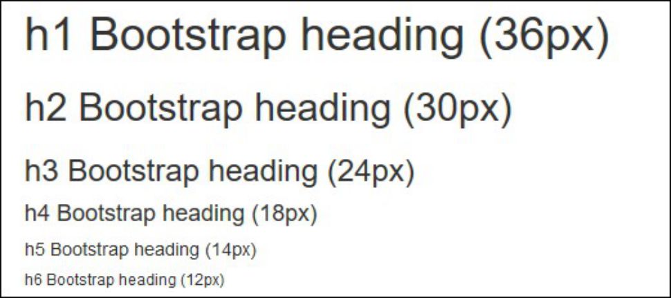
The <h1> to <h6> are all available to use and have the following sizes as shown in Figure 3.

Figure 3: Bootstrap version 3 offers six heading sizes.
To dive more deeply into the typography of Bootstrap, I recommend that you have a look at w3schools, which has a good overview here.
I know this framework is a big subject, and I could continue writing pages after pages about the basic setup, but I do encourage you to dive into the Bootstrap website to get more of the basics in place. But if you don’t have the time and you would like it “my way,” keep an eye on the MC Press Online website because I’ll continue this love story over the next few months.
Before we finish this article, let’s have a few more examples of what you can do with very little code in Bootstrap.
Bootstrap Wells
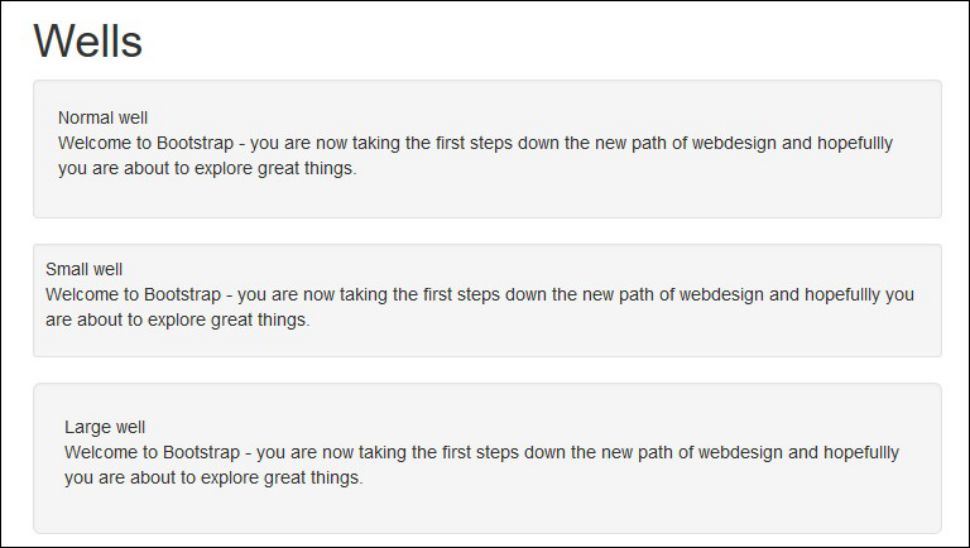
The well class will add a rounded border around an element and apply a gray background and some padding. To see it in action, enter the code below or download it at the end of the article.
<!DOCTYPE html>
<html lang="en">
<head>
<title>MCpressonline.com -> Bootstrap part 1 - ex2 - Wells</title>
<meta charset="utf-8">
<meta name="viewport" content="width=device-width, initial-scale=1">
<link rel="stylesheet" href="/bootstrap/css/bootstrap.min.css">
<script src="/bootstrap/js/bootstrap.min.js"></script>
</head>
<body>
<div class="container">
<h1>Wells</h1>
<div class="well">Normal well<p>Welcome to Bootstrap - you are now taking the first steps down the new path of web design and hopefully you are about to explore great things.</div>
<div class="well well-sm">Small well<p>Welcome to Bootstrap - you are now taking the first steps down the new path of web design and hopefully you are about to explore great things.</div>
<div class="well well-lg">Large well<p>Welcome to Bootstrap - you are now taking the first steps down the new path of web design and hopefully you are about to explore great things.</div>
</div>
</body>
</html>
This will look like Figure 4.

Figure 4: Welcome to the world of Bootstrap wells.
Bootstrap Alerts
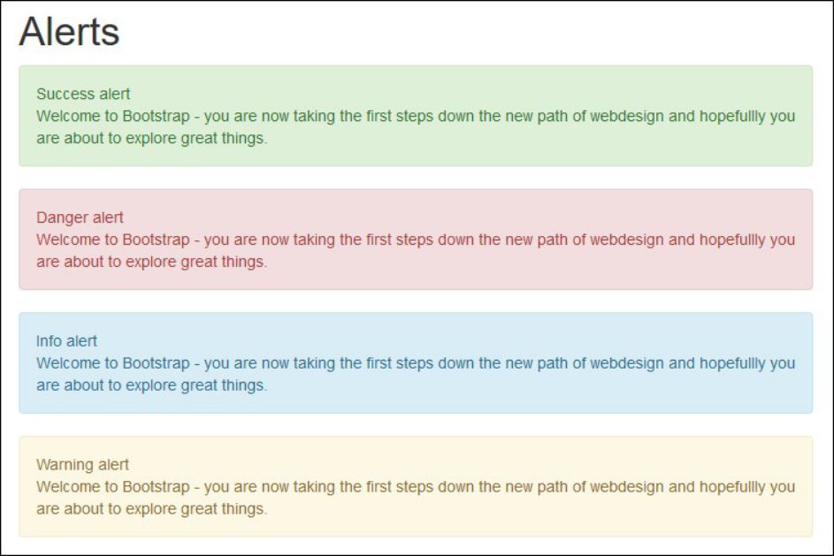
The alert class will create an alert message, which comes in four different colors all defined by classes.
Here is some code to create the Figure 5 example:
<!DOCTYPE html>
<html lang="en">
<head>
<title>MCpressonline.com -> Bootstrap part 1 - Alerts</title>
<meta charset="utf-8">
<meta name="viewport" content="width=device-width, initial-scale=1">
<link rel="stylesheet" href="/bootstrap/css/bootstrap.min.css">
<script src="/bootstrap/js/bootstrap.min.js"></script>
</head>
<body>
<div class="container">
<h1>Alerts</h1>
<div class="alert alert-success">Success alert<p>Welcome to Bootstrap - you are now taking the first steps down the new path of web design and hopefully you are about to explore great things.</div>
<div class="alert alert-danger">Danger alert<p>Welcome to Bootstrap - you are now taking the first steps down the new path of web design and hopefully you are about to explore great things.</div>
<div class="alert alert-info">Info alert<p>Welcome to Bootstrap - you are now taking the first steps down the new path of web design and hopefully you are about to explore great things.</div>
<div class="alert alert-warning">Warning alert<p>Welcome to Bootstrap - you are now taking the first steps down the new path of web design and hopefully you are about to explore great things.</div>
</div>
</body>
</html>

Figure 5: See Bootstrap alerts in action!
Bootstrap Jumbotron
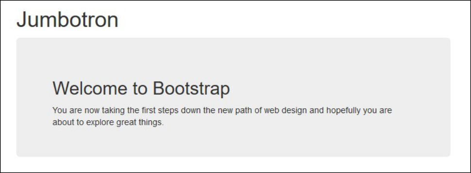
When you want to call for extra attention, use the jumbotron class, which will create a big box showing the information.
The jumbotron will be displayed as a grey box with rounded corners with the font size inside of it enlarged.
Here is some code:
<!DOCTYPE html>
<html lang="en">
<head>
<title>MCpressonline.com -> Bootstrap part 1 - jumbotron</title>
<meta charset="utf-8">
<meta name="viewport" content="width=device-width, initial-scale=1">
<link rel="stylesheet" href="/bootstrap/css/bootstrap.min.css">
<script src="/bootstrap/js/bootstrap.min.js"></script>
</head>
<body>
<div class="container">
<h1>Jumbotron</h1>
<div class="jumbotron"><h2>Welcome to Bootstrap</h2>You are now taking the first steps down the new path of web design and hopefully you are about to explore great things.</div>
</div>
</body>
</html>
It will look like this:

Figure 6: See the mighty jumbotron at work.
That’s All for Now, Folks
This sums up the first article in the Bootstrap series.
Ahead of us, we have grids, tables, buttons, images, glyphicons, and much more, so stay tuned for the next articles. Till then, “Don’t end up in the trap; starting using Bootstrap.” (Do not quit your day job, Jan!)
To download all the code, click here.


LATEST COMMENTS
MC Press Online