In my previous article, I introduced the GridX library and a few of its features. In this article, we'll take a deeper dive into GridX features.
In today's TechTip, we'll look at examples that show widgets in cells, embedded forms, and tree grids.
Example with Widgets in Cell
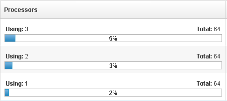
In the previous TechTip, we put text and/or images in a table, but now you might want to spice it up a bit with something fancier. GridX allows you to put widgets in table cells using the "decorator." For example, progress bars are inserted into a column by the code below. (Here's a reference for the progress bar widget.) The important features to notice are 1) widgetsInCell is set to true, 2) the decorator returns the template string for the widget, 3) gridData is what is returned from the formatter, 4) the storeData is the data in the store, and 5) cellWidget refers to the widget that is placed in the cell. For more detailed information, you can refer to the GridX documentation for cell widgets.
{
id : 'cpu', field : 'cpu', name : nls.cpu,
widgetsInCell: true,
formatter: function(data) { return data; },
decorator: function() {
return '<div data-dojo-type="dijit.ProgressBar"></div>';
},
setCellValue: function(gridData, storeData, cellWidget) {
var widget = registry.byNode(cellWidget.domNode.lastChild),
allocated = gridData.cpu,
total = hostStats.cpu.total;
widget.set('maximum', total);
widget.set('value', allocated);
if (cellWidget.domNode.firstChild.className === "hostAllocs") {
domConstruct.destroy(cellWidget.domNode.firstChild);
}
domConstruct.place(
'<table class="hostAllocs"><tr>' +
'<td>' + num.format(allocated) +
'</td><td>' + num.format(total) + '</td>' +
'</tr></table>',
cellWidget.domNode, "first");
}
}
Notice that we are inserting a div with some summary text above the progress bar widget using the DOM construct. We have to ensure we destroy and recreate that DIV when the data value changes. The column would look something like this:

Figure 1: Progress Bar Widget in Cell
Example with Embedded Form
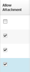
It is also possible to embed a form within a GridX. This can be useful if you want a quick way for the user to edit the table data. To do this, you need the Edit module ("gridx/modules/Edit"). There are five major components: 1) set the "editable" value to true, 2) provide the widget path to the "editor" parameter, 3) set "alwaysEditing" to true (unless you want to toggle the table between an editing/non-editing mode), 4) put the parameters passed to all form widgets in the "editorArgs.props" field, and 5) set the "fromEditor" if necessary. The "fromEditor" function is called when the form field value has changed, allowing you to set the store value appropriately. In the case below, we use the "fromEditor" function to make sure the store value is set to a Boolean value. The following code shows the layout setup for a column that has a checkbox for allowing (or denying) attachment:
{
id: 'enabled',
field: 'enabled',
name: "Allow Attachment",
editable: true,
editor: "idx/form/CheckBox",
alwaysEditing: true,
editorArgs: {
props: 'label:"Allow Attachment", showLabel: false',
fromEditor: function(value) {
if (value) {
return true;
} else {
return false;
}
}
}
},
The column would look something like this:

Figure 2: Example with Embedded Form
A few notes of caution: Mixing in the Edit module allows you to set up editable fields, but it does not make all the fields editable; you must do the setup above for all of the columns that you want to be editable. Also, there can be some cell focus problems that need to be worked out, particularly if you're trying to ensure that the grid is keyboard accessible. More information about the Edit module can be found in GridX's documentation.
Example with TreeGrid
Another feature GridX provides is the TreeGrid widget. The GridX tree module allows GridX columns to be expanded and collapsed. For example:

Figure 3: Example Columnar Tree Grid
In order for your grid to work, not only must the tree module be imported, but the store must be set up appropriately as well.
test_func: function() {
var store = new MemoryStore({
data: [
{
id: 1,
name: "Ben Cartwright",
type: "Father",
// this field does not need to be named children,
// but needs to be consistent with what is used
// in the hasChildren and getChildren methods
children: [
{
id: 2,
name: "Adam Cartwright",
type: "Son"
},
{
id: 3,
name: "Eric \"Hoss\" Cartwright",
type: "Son"
},
{
id: 4,
name: "\"Little\" Joe Cartwright",
type: "Son"
}
]
},
{
id: 5,
name: "Isaac",
type: "Father",
children: [
{
id: 6,
name: "Jacob",
type: "Son"
},
{
id: 7,
name: "Esau",
type: "Son"
}
]
}
]
});
// NEW you must provide hasChildren and getChildren methods for the store
store.hasChildren = function(id, item) {
return item && item.children && item.children.length > 0;
};
store.getChildren = function(item) {
return item.children;
};
this.test = new Grid({
store: store,
cacheClass: "gridx/core/model/cache/Sync",
structure: [
{
id: "name",
field: "name",
name: "Name",
expandLevel: 'all' // NEW
},
{
id: "type",
field: "type",
name: "Position"
}
],
modules: [ ColumnResizer,
TreeGrid // NEW
],
treeExpandLevel: 1, // NEW
autoHeight: true
});
this.set('content', this.test);
}
If you use the filter module with a columnar tree grid, the filter will only operate on the root rows (in our example, "Ben Cartwright" and "Isaac"). Did you notice that I referred to this as a "columnar" tree grid? There is also a "nested" tree grid mentioned in the GridX documentation, but it is more complicated.
Tips and Tricks
In addition to the many features, there are also pitfalls when using GridX.
- When displaying numbers, make sure they are not stored as strings. Use number.parse() to convert if necessary. Otherwise, the sorting will use a string compare.
- The initial sort can be controlled by setting the sortInitialOrder. You can also control whether it's an ascending or a descending sort:
sortInitialOrder: [
{
colId: 'pool_free_capacity_gb',
descending: true
}
]
- "sortInitialOrder" can receive an array for nested sorting—for example, sorting by the host column and then by the name column:
sortInitialOrder: [
{
colId: "host"
},
{
colId: "name"
}
]
- Give each row a unique id. Otherwise, row selection might not behave appropriately.
- Default column widths can be set in the layout. For example, defaulting the first column to 15% of the total width is as easy as this:
layout = [
{
id: 'type',
field: 'type',
name: nls.type,
width: "15%",
formatter: function(obj) {
return "<div class='" + styleMap[obj.type]
+ "'></div>" + nls.types[obj.type];
}
}, //...
- Module parameters can be accessed according to a naming convention based on the module the parameter is in. For example, the field "multiple" in the module gridx/modules/select/Row.js is named "selectRowMultiple." To set this variable you could write this:
modules: [ SelectRow ],
selectRowMultiple: false
Onward and Upward
Even with these two TechTips, we're just scratching the surface of what you can do with GridX. I haven't even touched on how to create custom header bars or use many other GridX modules, but this gives you a good start on using some of GridX's more advanced features. As always, you have to keep things in balance and not clutter your grids with eye candy that will just confuse the user. But, used tastefully, these features can be powerful enhancements to your website.


LATEST COMMENTS
MC Press Online