In this tip, I present two slightly unusual types of chart, named "Bars of Stuff" and "Piles of Money." Some presentations require a more humorous and lighter tone, especially if the news isn't good!
After so many TechTips about serious charts, it's time to have a little fun, so let's start with "Bars of Stuff." This is basically a bar chart in which the bars are replaced with a cartoon-like object. The image choices include Train (default), Chocolate, Rope, Truffle, Worm, and Horse. From a technical point of view, this is a very simple chart: it supports two columns, "label" and "value," and multiple rows. There's a little trick on the rows, though: instead of showing only the title of the row next to the "bar," you can also include a string, defined by you.
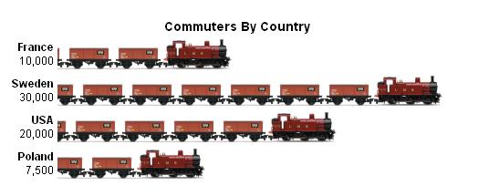
Figure 1 depicts the example from the API's documentation:
Figure 1: The Trains example from the documentation page shows commuters by country.
Let's have a quick look at the template:
/$Header
<html>
<head>
<link rel="stylesheet" type="text/css" href="http://visapi-gadgets.googlecode.com/svn/trunk/barsofstuff/bos.css"/>
<title>
/%PageTitle%/
</title>
<script type="text/javascript" src="http://visapi-gadgets.googlecode.com/svn/trunk/barsofstuff/bos.js"></script>
<script type="text/javascript" src="http://www.google.com/jsapi"></script>
<script type="text/javascript">
google.load("visualization", "1");
</script>
<script type="text/javascript">
function drawChart() {
var data = new google.visualization.DataTable();
data.addRows(/%TotalRows%/);
data.addColumn('string', 'Label');
data.addColumn('number', 'Value');
/$Row
data.setCell(/%RowNbr%/, 0, '/%RowTitle%/');
data.setCell(/%RowNbr%/, 1, /%RowValue%/, '/%RowValueLabel%/');
/$OptionsBegin
var options = {
/$Option
'/%OptionTitle%/': /%OptionValue%/
/$OptionsEnd
};
/$Footer
var chartDiv = document.getElementById('chartdiv');
var chart = new BarsOfStuff(chartDiv);
chart.draw(data, options);
}
google.setOnLoadCallback(drawChart);
</script>
</head>
<body>
<div id="chartdiv"></div>
</body>
</html>
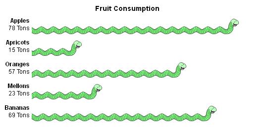
The only "new" thing in this template is the RowValueLabel variable, which will store the text that shows under the row title; I'm talking about the "10,000" under "France" on the first row of the example shown in Figure 1. There's no "Column" section, and the "Row" section is a hybrid between the "FirstRow" and "Row" sections of previously presented templates. This was possible because the "Bars of Stuff" chart supports only one value per row. The procedure that implements this template is called GenBOSChart, and it's very similar to the ones I've written for other chart types; the only difference is the handling of the aforementioned RowValueLabel variable. The sample program TSTGENBOS1 produces the chart shown in Figure 2:
Figure 2: Who said a bug was a bad thing?
If you take a look at the source code, you'll find the by-now-familiar filling of the procedure arrays (P_BOSRowDS and P_OptionDS, in this case), followed by the invocation of the procedure and the showing of the HTML page it generated.
I'd like to take a moment to explain the most important option of this chart: the "type" keyword. This is the way to indicate which object you want to use instead of the traditional bar; in this example, I'm using the "worm" attribute to produce the cute green bugs you see in Figure 2. Read the Bars of Stuff API documentation to find out what else you can customize on this chart.
Now it's up to you to choose where and when to use this less serious and more smile-inducing chart type!
The second part of this TechTip will focus on the "Piles of Money" chart type. As usual, let's start by reviewing its template:
/$Header
<html>
<head>
<link rel="stylesheet" type="text/css" href="http://visapi-gadgets.googlecode.com/svn/trunk/pilesofmoney/pom.css"/>
<title>
/%PageTitle%/
</title>
<script type="text/javascript" src="http://visapi-gadgets.googlecode.com/svn/trunk/pilesofmoney/pom.js"></script>
<script type="text/javascript" src="http://www.google.com/jsapi"></script>
<script type="text/javascript">
google.load("visualization", "1");
</script>
<script type="text/javascript">
function drawChart() {
var data = new google.visualization.DataTable();
data.addRows(/%TotalRows%/);
data.addColumn('string', 'Label');
data.addColumn('number', 'Value');
/$Row
data.setCell(/%RowNbr%/, 0, '/%RowTitle%/');
data.setCell(/%RowNbr%/, 1, /%RowValue%/, '/%RowValueLabel%/');
/$OptionsBegin
var options = {
/$Option
'/%OptionTitle%/': /%OptionValue%/
/$OptionsEnd
};
/$Footer
var chartDiv = document.getElementById('chartdiv');
var chart = new PilesOfMoney(chartDiv);
chart.draw(data, options);
}
google.setOnLoadCallback(drawChart);
</script>
</head>
<body>
<div id="chartdiv"></div>
</body>
</html>
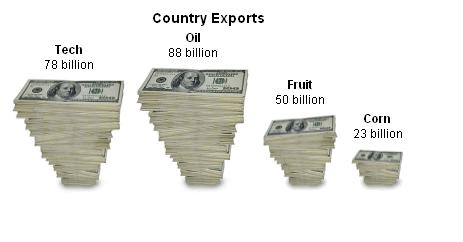
As you can see from the template above, the structure of the "Piles of Money" chart is an almost exact copy of the "Bars of Stuff," with some changes on the Header and Footer sections. This led to the creation of a procedure similar to GenBOSChart, named GenPOMChart. All I've written about GenBOSChart directly applies to this new procedure. The result, however, is very different. Below you'll find the chart produced by the sample program TSTGENPOM1:
Figure 3: That's a lot of money!
You can display one of two currencies here; the sample program uses USD, which is also the chart's default, but you can also use EUR. Be sure to read this API's documentation, because there are a few more options to customize.
Even though you won't find samples for these charts on Google's Code Playground, you can still test them there. Here's how to do it: go to the chart's documentation page and copy the sample you'll find there. Next, go to the Code Playground, choose any chart type, click the "Edit HTML" button and delete all the code. Next, paste the sample code on the code window of the Playground. If everything appears on a single line, delete it and paste it on Notepad; select everything from Notepad and copy it again. Paste it in the code window and voilá!
Here's the complete source code for this series. If any part of this TechTip is not clear for you, feel free to contact me. However, I really recommend reading the whole series first, starting with Part 1, because each Tip details a bit of the process.
The next TechTip will discuss an API that is not a chart, but it might be equally important. I'll talk about the Table API.


LATEST COMMENTS
MC Press Online